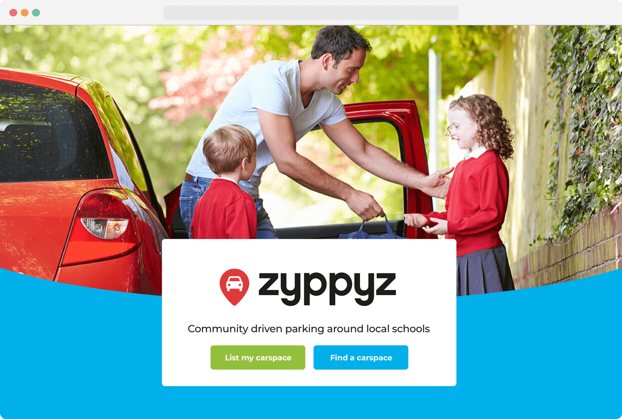
Zyppyz
UX→UI for a parking marketplace targeted towards schools.
Web
UX design, UI design, interaction design, user research, illustration, product strategy
Background
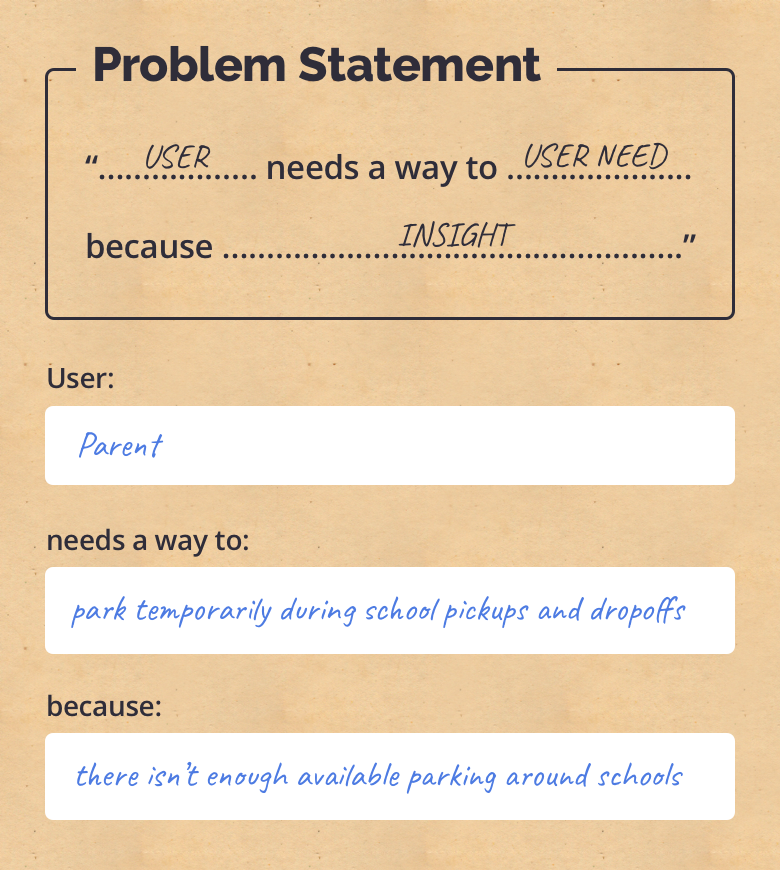
During my tenure at Wave Digital, a local Melbourne based client came to us with the problem of parking scarcity around schools. Upon further research with the client it became apparent that the parking situation and needs for school drop offs and pickups are different to that of other scenarios, and hence called for a more targeted solution.
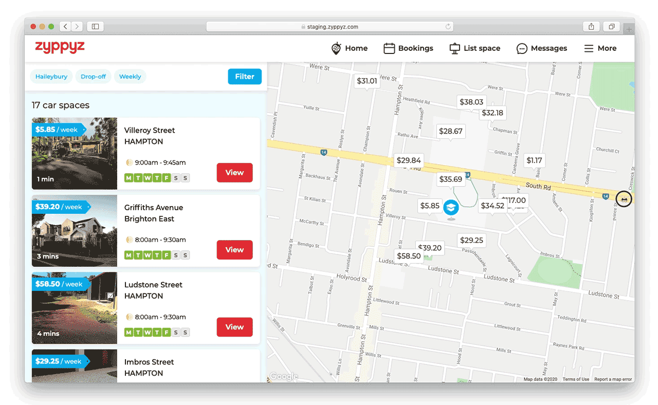
A fully responsive experience designed for React.
Research & discovery
To accomodate the client’s busy schedule, we ran a number of in person and online workshops to elicit and articulate the problem. Loosely following a Google Sprints recipe, were able to define our mission, audience, as well as validate a key assumption: “Are local residents willing to rent out their carspace to parents?” A quick none digital experiment proved the answer pointed to yes. The client had spoken to numerous parents and local residents and became our key subject matter expert.
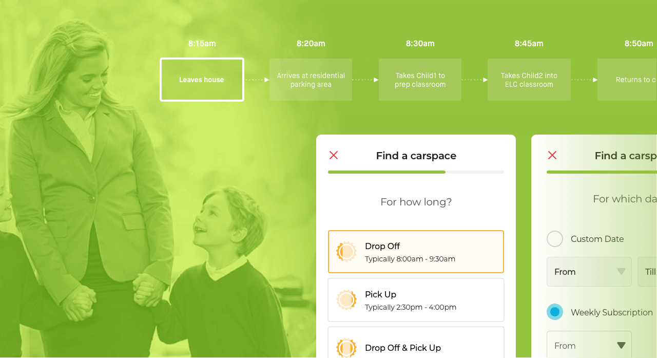
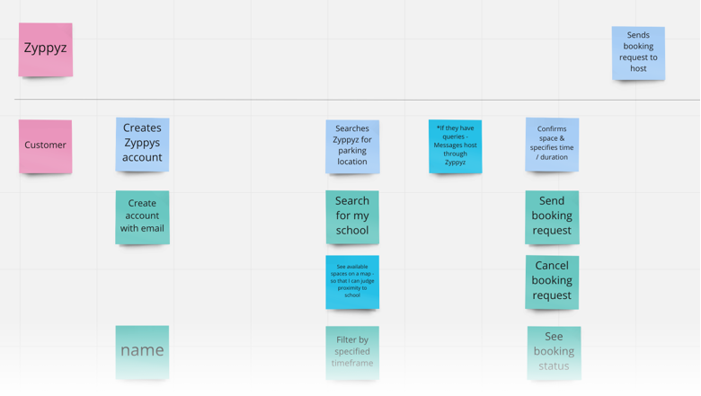
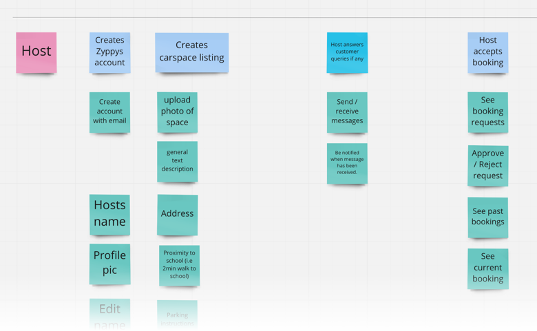
User story mapping
Once the players had been defined, I worked with the client to define a key task flow. From there on, we were able to systematically prioritise features which were associated with each task (i.e Account creation methods, do we really need social sign in for an MVP? All valid points to consider when launching on a budget). It was important to visually see these mapped out, so as to clear up any ambiguities around assumed features, as each feature pushes out the timeline more and more.
Ideation workshops
After core features had been defined, it was time to step up the fidelity. I facilitated an ideation workshop which involved our clients as key stakeholders, along with our product manager and tech lead. It was important to get all their input as each member is able to provide a valuable and unique perspective on solving this problem. Together, we sketched out ideas on how we envisioned the core taskflow, beyond post-its, making room to articulate business logic and indicate rough UI interactions.
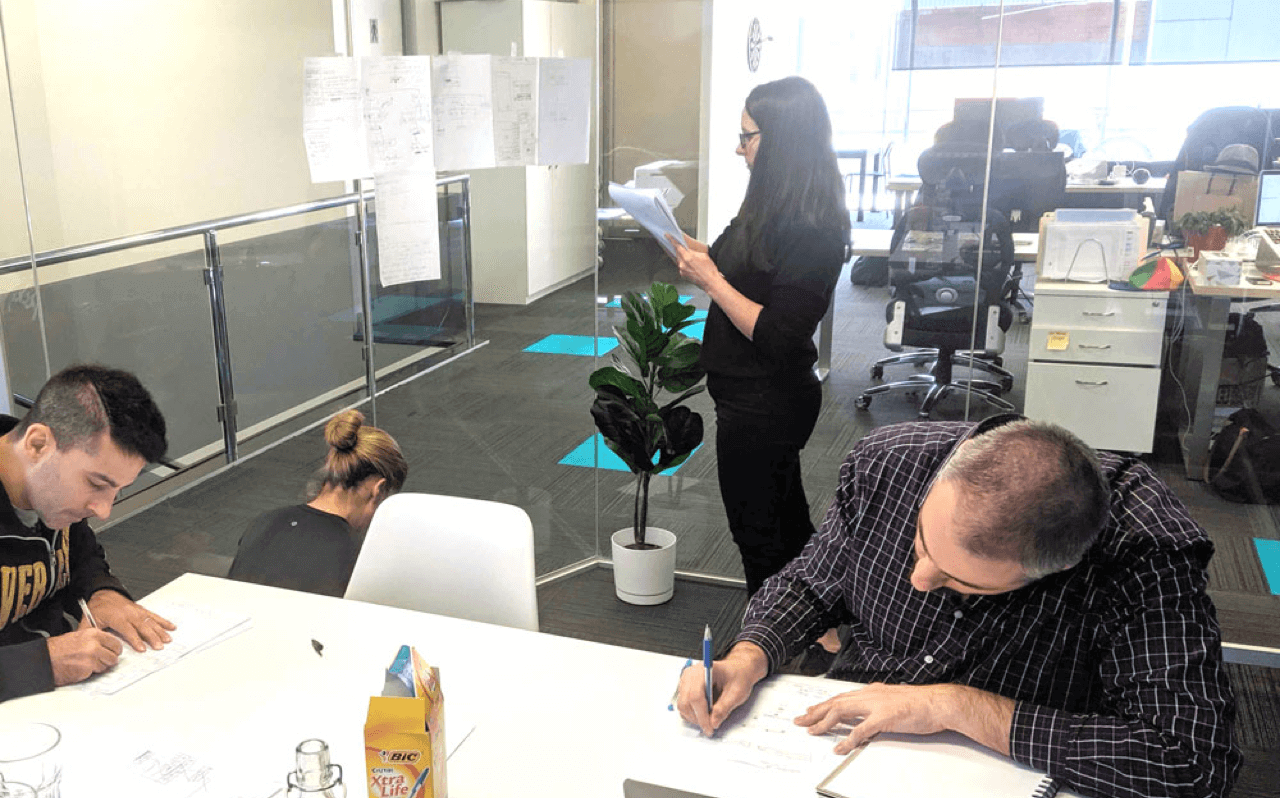
Hard at work, sketching away during our ideation workshop
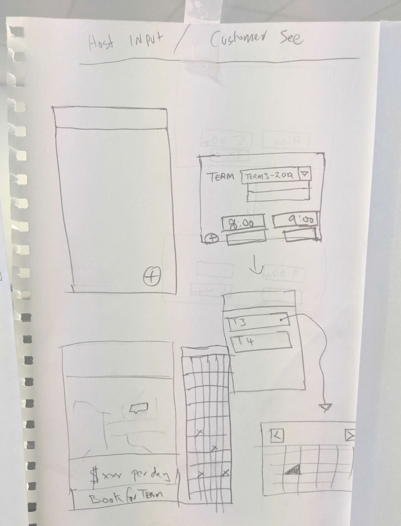
A concept from our tech lead conveying some UI interactions and business logic
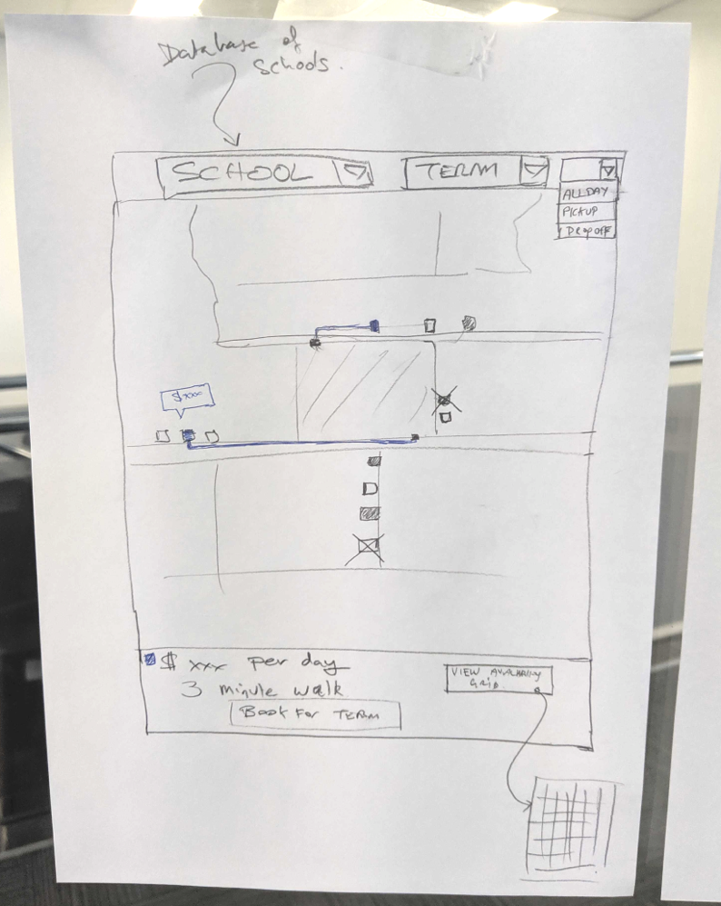
Another concept from the team showing map interactions and implying what data to use.
Wireframing
With the teams sketches in hand, I was able to take those ideas and further realise them in low fidelity mocks done in Sketch. I then wired up the screens show all the various flows for stakeholder reviews. The wireframing process went through 3 iterations before we were ready to move onto high fidelity.
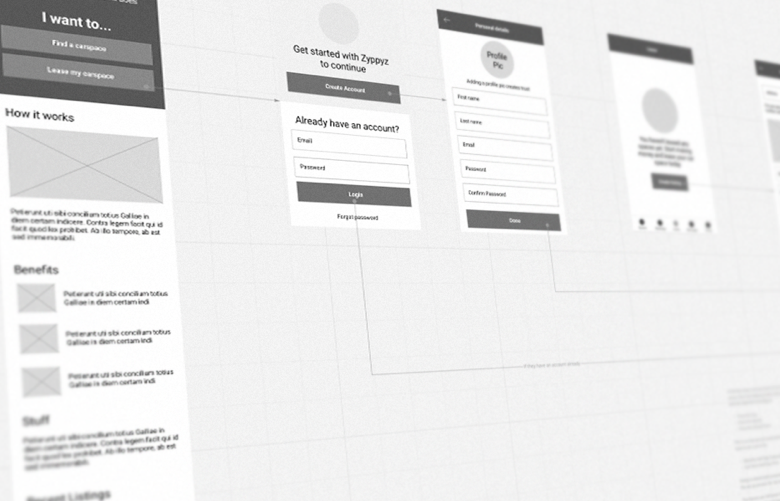
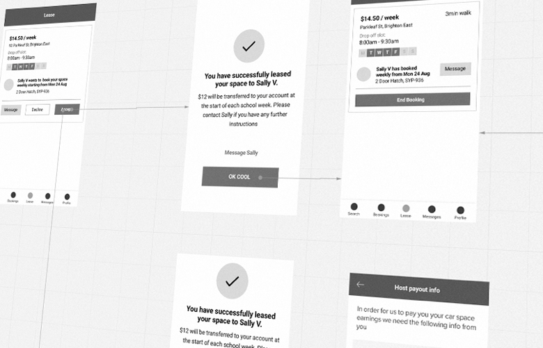
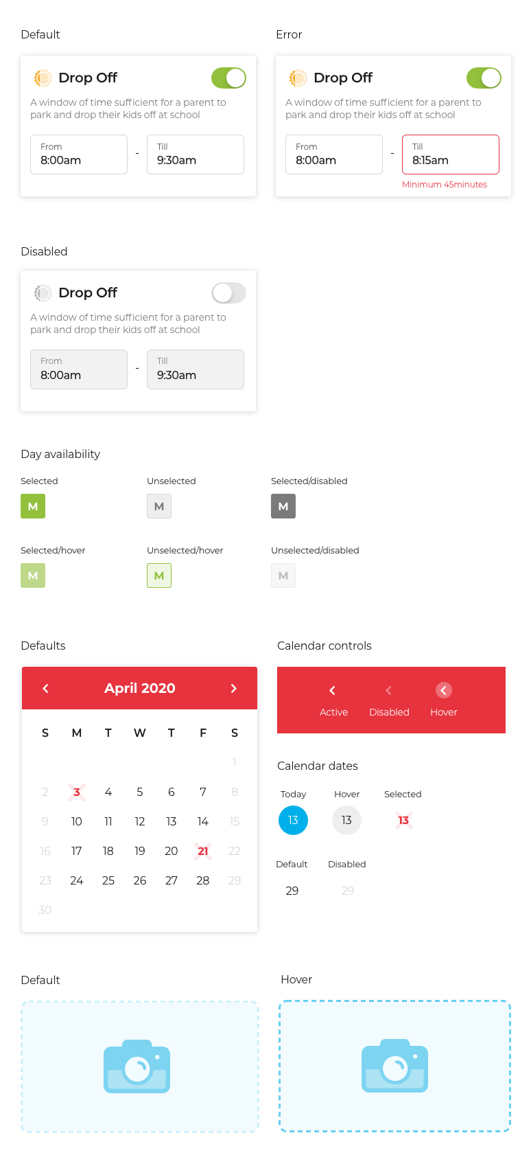
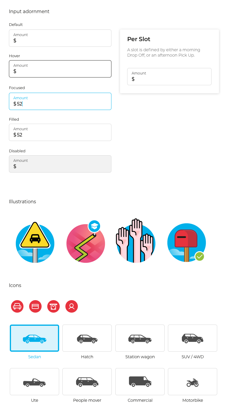
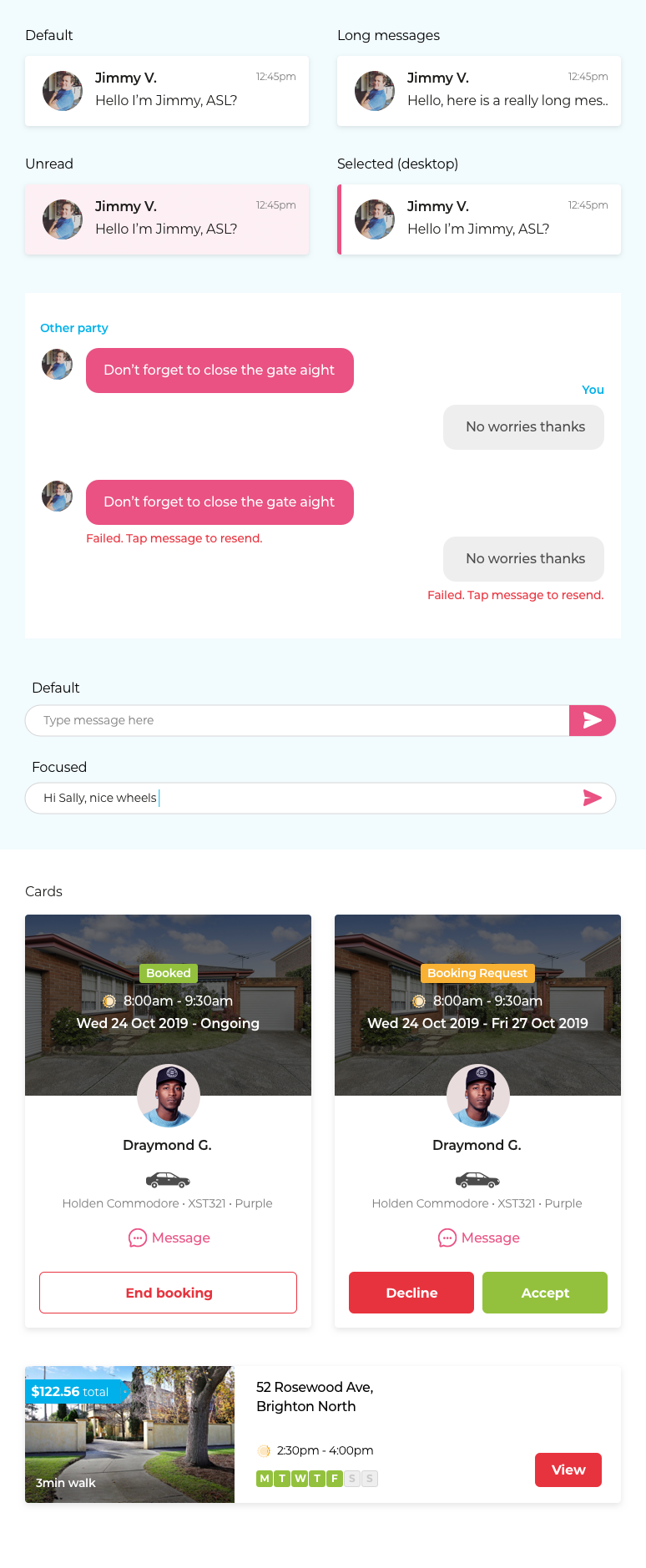
Design system
The initial MVP launch was to be for a responsive web app built in React. Through our initial strategy sessions, it had been raised that there were plans to release the product on iOS and Android later on. Hence the design system needed to be flexible enough stylistically to adapt to all platforms, while maintaining the look and feel of the branding provided by an external agency. The design system was constructed in Sketch and delivered in Zeplin to development.