VCAT
Userflow and micro-interactions for a hearings look-up and payments portal
Web
UI design, interaction design, user testing

Background
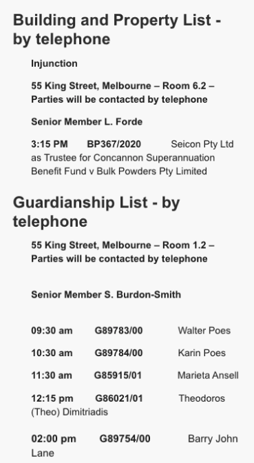
One of the most visited sections of the VCAT site is the hearings page. Here, users can look up when and where their hearing is. The previous state of it was pretty basic. Pain points included:
- Difficult to find your case, as there's hundreds of cases to scroll and sift through every day
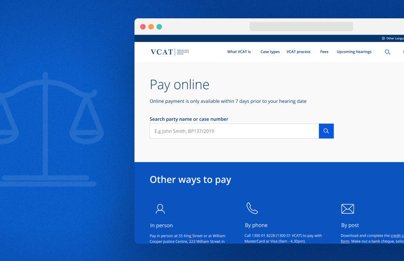
- No clear way to pay for your hearing online
- Unclear labelling of case details
- Lack of accessible information surrounding the hearings process

The old version of hearings.
Userflow
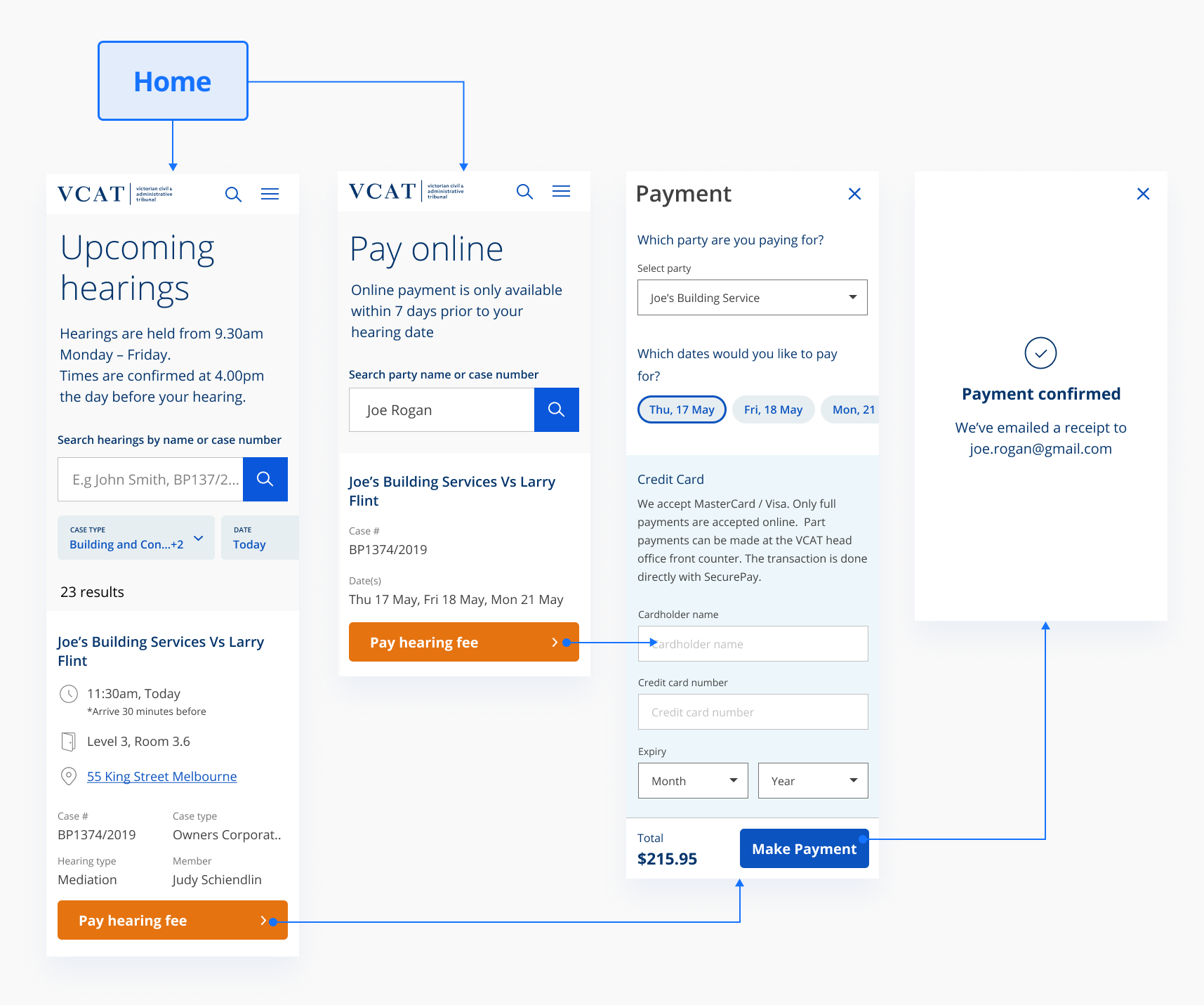
As the components had already been made, it was a matter of dragging and dropping in components from our new design system, allowing me to prototype and test straight away in high-fidelity. Here I've constructed a userflow using such components to link hearings to a new online payment portal.

Payment portal accessible from both the hearings page, and payments page
Mircro-interactions
Various micro-interactions were implemented in order to allow the user to complete their tasks as smooth as possible. They include:
- Search filters anchoring to the top, allowing the user to filter throw results at any point in the scroll region.
- Important information about hearings anchoring to the right, allowing quick access to queries around the process whilst in context.
- Horizontally scrollable date selectors on the mobile payments page, to allow for multiple day hearings to be listed.
- A skeleton loading state when fetching results, to re-assure the user their input has been acknowledged.
Desktop experience starting from the hearings page
Mobile experience starting from the payments page
Outcome
The above prototypes were usertested with a 100% pass rate on first iteration. Users clearly understood how to look up their case, and pay for it. This feature is being built in React and is currently in development (as of Aug 2020).