The Happy Habit
End to end design for a React native meditation app
iOS, Android
UX design, UI design, interaction design, user research, branding, illustration, product strategy
Background
Fleur Chambers is an established Melbourne meditation teacher with a large online and local following. She runs in person workshops and offers guided meditations on various platforms. She came to Wave Digital during my time there wanting to rebrand her business and also launch a native app to extend her offerings and reach.
Approach
Through initial discovery workshops, we helped the client define what her goals were with the app, both from a business and personal stance. From defining success, as well as failure in tangible terms, this set the trajectory for the app’s direction. As this was the first ever iteration, it was important to approach it with a truly MVP mindset in order to make the most of the budget and timeline.

“A tool to strengthen and grow the business”
User research
Having had years of interactions with her own audience and a sizeable online following to observe, this allowed us to gain deep insight into her target audience. We worked with her to create personas in order to narrow the team’s focus and feature set.
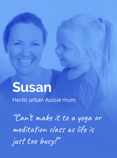
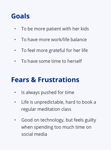
1 of 3 personas the app would be targeting
Mapping it out
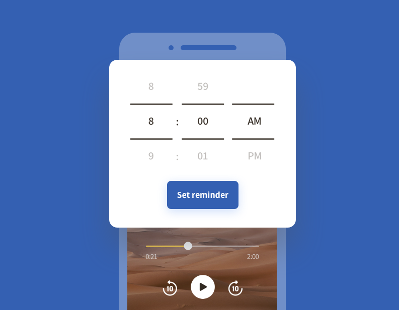
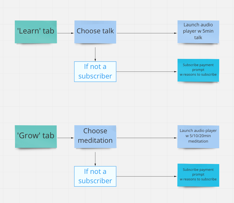
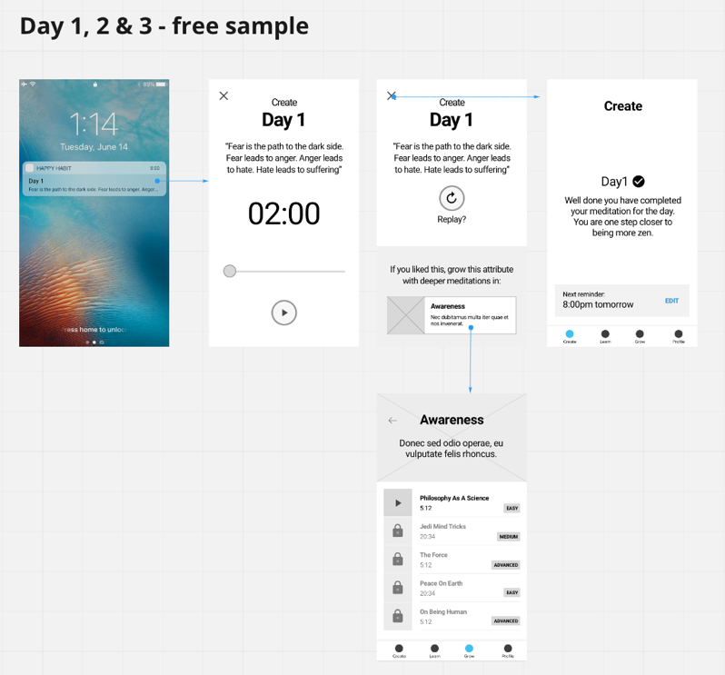
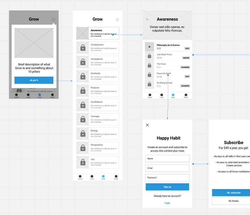
Having done our discovery workshop, we established the core feature of the product is to create a habit through a daily notification system. Together with the client, we mapped out a task flow around this core feature. Starting from the lowest fidelity allowed us to focus on what mattered, free from aesthetic distractions. Doing it this way also allowed us to iterate through a business model quickly and iron out ambiguities without wasting time on labourious UI.
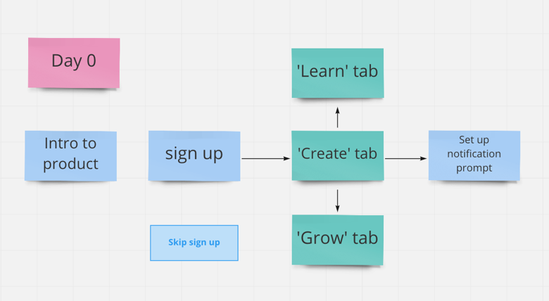
The onboarding and set up flow of the app was crucial to the main business objective.
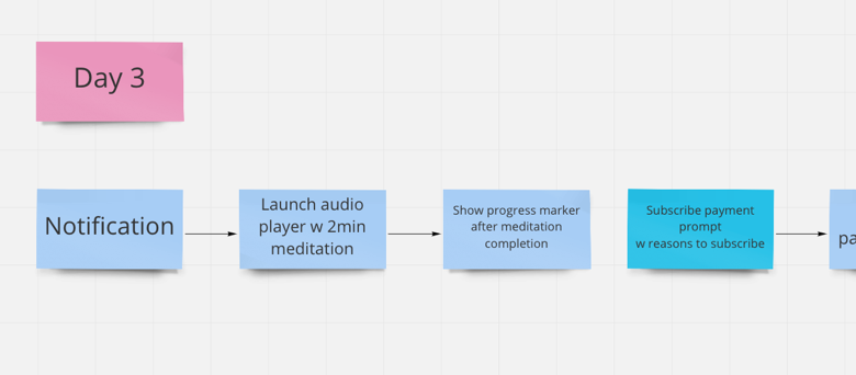
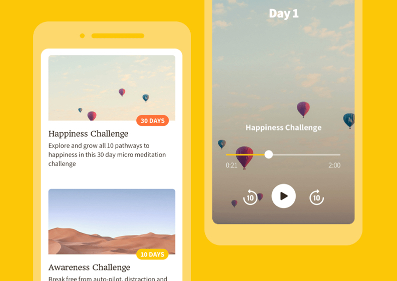
The app would offer 3 days of free content before prompting a subscription
Wireframes
Once we had settled on a taskflow, it was time to step up the fidelity with a tangible set of wireframes. From here on we can further articulate finer aspects like what UI components are needed and how well the userflow is being communicated.
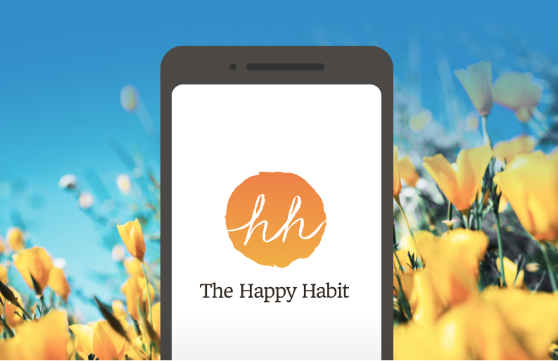
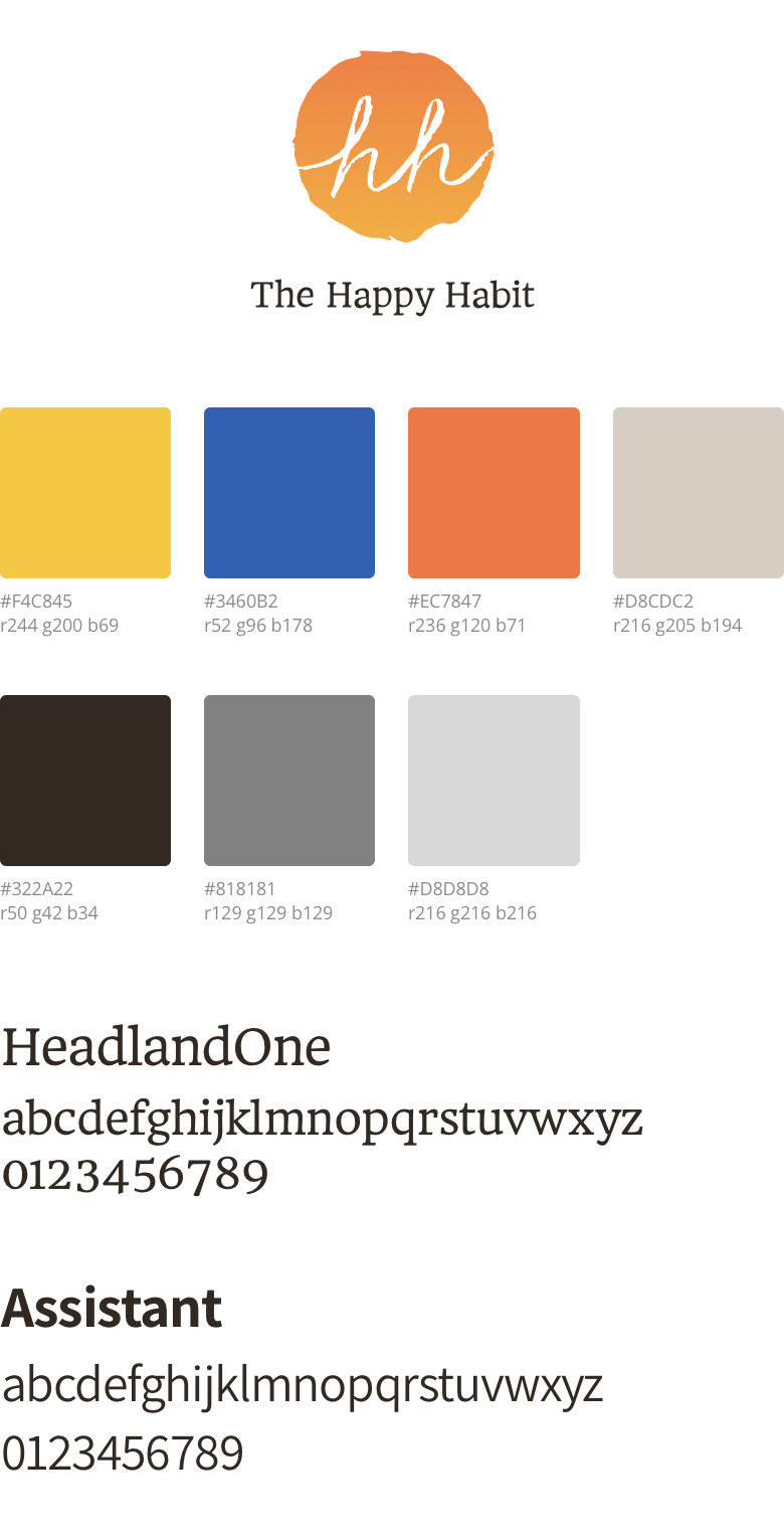
Branding
While the UX side of things were being designed and under client approval, we also tackled the branding concurrently. The client wanted something personable, warm and organic feeling to stand out from the majority of cold techy feeling apps in the market.
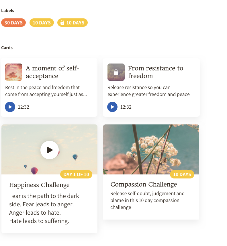
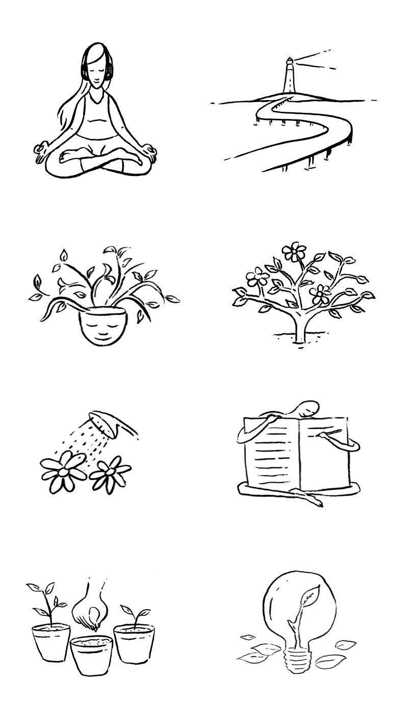
Illustration
Along with the vibrant colour scheme, and hand crafted logo, I also provided idiosyncratic illustrations that would feature throughout the app’s UI and marketing.
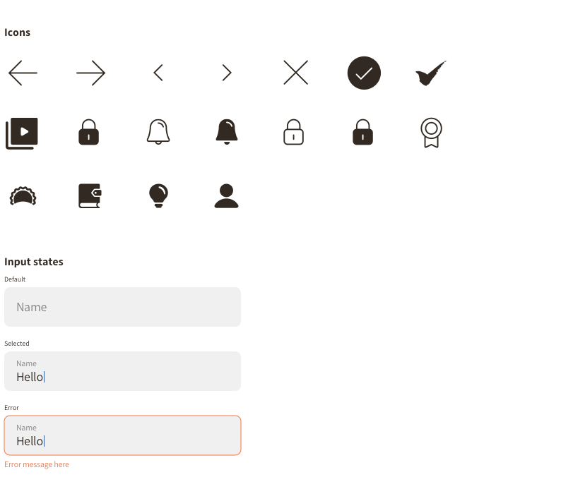
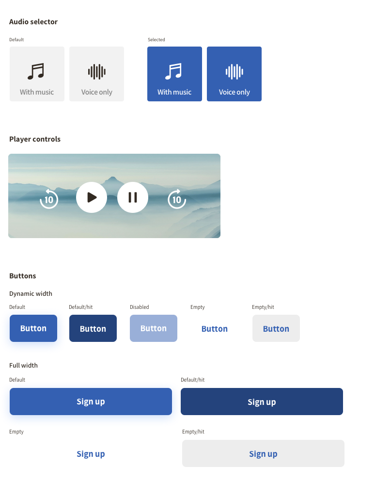
UI Design system
The this was to be made in React native, the UI needed a style that was familiar to both iOS and Android. Not too Material, yet not too HIG. A style generic enough to be understood by both user bases, at the same time unique enough to leverage the branding.